Differences between the adaptive and responsive web design
Every day, millions of users connect to the Internet from different devices, but increasingly, they do so from mobile devices, namely smartphones and tablets. The change in screen size and resolution thereof between a smart TV and a smartphone for example, is something to keep in mind when viewing a web. Navigation using one or another type of devices change radically and that is why the user experience offered by our website must adapt to all formats.
Despite this evidence, many companies still see mobile devices as something too much and think that with having a web desktop, with viewing on mobile, is sufficient. Notably, three major problems: time too long for Webtop load on mobile devices, downloads and format, requiring the use of zoom to see details.
 If the way to navigate the user has changed, brands should take this into account. Bounce rate of a web adapted to mobile it is not due to a bad user experience and possibly no longer return.
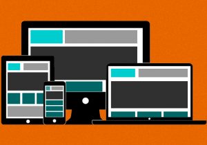
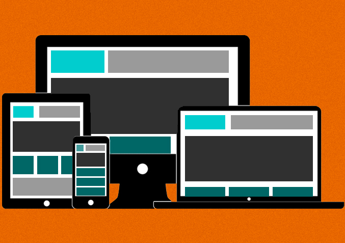
So hurry to make your website accessible to all devices. Surely you’ve heard of responsive or adaptive design. It is a flexible program that allows code to rearrange the elements of the web adapted to the screen resolution where they are being displayed. But responsive and adaptive design means the same?
Differences between web design and adaptive called “responsive”
As we mentioned above, the responsive web design, restructuring on the device display elements of the web to optimize all available space and provide an excellent user experience.
This is achieved by setting a margin widths and design proportional sizes, rather than fixed values set in the pixels. You also need to use “media queries” and stylesheets to fix for each screen size CSS.
For example, a horizontal menu becomes vertical when viewed on smartphones, avoiding the endless scrolls and organizing the contents in a better way. The only disadvantage of this technique is that web design elements are not resizable, such as videos and banners, they do not change their size depending on the device.
An adaptive web design, on the other hand, is not as flexible as responsive.Use preset screen sizes (computer – 400×100 pixels, starting with 240×320 pixels – mobile devices). An adaptive design does not need as much code as one responsive to their CSS.
That is why the most recommended option is usually to use a responsive web design, even if it means extra time in their development. The good news is that there are now web publishers cloud that allow us to create such online websites without programming knowledge quickly and easily.
The trend towards responsive is not new but it looks like a more extended form for the future creation of web pages. Thanks to new models editor is not necessary to learn how to program or have large budgets to design your multi-device web. Just take a few minutes and select quality content for your visitors.
About author
Leave a reply