Effect Responsive Design before the rise of mobile technology
We have long heard that 2013 will be the year of Responsive Design. Yet there are still many companies that have chosen to ignore it and not betting on this technique of adapting their websites and emails to mobile devices.However, data are increasingly clearer to show that they are wrong: the Responsive Design is a must!
That’s why we decided to put all the evidence in this article to convince even the most skeptical that without Responsive Design can not connect with today’s consumers.
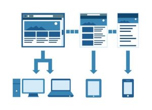
 More devices
According to the report Quarterly Mobile PC Shipment and Forecast Report DisplaySearch NPD, in 2014 364 million tablets will be sold throughout the world figure will mean that tablet sales to double to notebooks. And this figure is not going to stop growing because in 2017 there will be 5 tablets per PC, according to Canalys.
For our part we follow this global trend, and between 2011 and 2012 the presence of tablets in tripled and our country was the European leader in smartphone penetration and growth, according to the IAB and Google. Currently, only the first half of 2013 tablet sales have increased 193% according Context, demonstrating that this growth continues unstoppable.
The consumer no longer connected mainly from PC
And every time they do less. Users have more devices (smartphones, tablets, PCs, etc.), and this entails a radical change in consumer habits and buying it directly affects businesses.
Countries fastest growing in m-commerce and in 2012 purchases through these devices already generated 202 million euros. A not inconsiderable number, but nothing compared to the nearly 1,500 million euros is expected to be reached in 2017, according to Forrester Consulting study for PayPal.
Consumers increasingly will buy more through these devices and will be increasingly demanding with the shopping experience you want. And as evidenced by a report Baynote, according to which 16.8% of smartphone buyers and 15.5% of tablet buyers say their shopping experience did not meet your expectations. Therefore, if the whole buying process is not optimized, both the email and the web and payment, the user will leave the web for competition and will not return.
And we must consider also talk about a particularly attractive buyer not only because it is the consumer of the future, but also because it spends more, as shown by the data in the Adobe Digital Marketing Insights. According to this study users who access online stores from tablets spend 21% more users entering from your computer, and get to spend 54% more users who access from smartphones.
Need for web and email optimized
Therefore mobile optimization is no longer an option but a necessity, which directly affects sales. According to Forrester Consulting study for PayPal, creating a channel of mobile commerce increases sales of online business an average of 15%.
The same is true with email marketing, the gateway to many of the sales, especially for Pure Players. According to research by Inbox Marketer, 70% of recipients who opened the email on mobile devices, remove if not look good, even without reading. And considering that in the summer of 2013 more than 46% of emails are opened on mobile devices, not optimized for mobile emails is to lose sales directly before starting.
About author
Leave a reply